Applying timeless page design principles to the web
11 February 2012
This morning I found Alex Charchar’s page on ‘the secret canon & page harmony’ as presented in the past by Jan Tschichold.
Using the Van de Graaf Canon, one divides the a page spread thus:

This is based on a 2:3 ratio page size. However, the spread makes the overall ratio 4:3.
Not coincidently, our monitor resolutions are based on a 4:3 ratio:
1024 = 4(256) = 1024
768 = 3(256) = 768
1280 = 4(320)= 1280
960 = 3(320) = 960
We can apply the Van de Graaf Canon to a 1024 x 768 webpage like this:

As Tschichold showed, the circle is indicative that height of the resulting textblock is equal to the width of the page, or in our case, ½ of the page (1024/2 = 512).
Tischold’s summarized Van De Graaf’s geometric method as the simplest way to create the outlines that were also used by medieval scribes, which all result in a text-block that fits within a 9 x 9 grid.

Essentially, we can determine the size and position of a content block by taking any page size and dividing it up into a 9×9 grid.
A book spread which divides both pages into 9 columns results in a grid of 18 columns and 9 rows: however, our 18 rows can be condensed into a 9 x 9 without loss of effect. (Eighteen columns merely subdivides the otherwise 9 into halves).

The content block sits 1 column in, two columns above the bottom, and 1 column from the top.

Responsive Web Design
All of this would create a wonderful guideline for laying out the basics of a webpage were this still 2005 and 1024×768 had become the ne-plu-ultra after years of 800×600 CRT monitor resolution settings. Today (early 2012), a webpage needs to resolve on a variety of screens, from iPhones to giant monitors.
In order to have responsive content, it helps to code elements as percentages rather than specific pixels.
Our 1024 x 768 example creates a content block with an 87px top margin, a 166px bottom margin, and side margins of 112. The content box itself measures 800x 512 (the height is equal to half: 1024/2 = 512).
Coding anything in pixels though is unreliable since browser windows are never consistently sized across machines, and padding creates effects which makes pixel precision difficult.
What is needed is to achieve this 9×9 grid with percentages, so that this proportion can be rendered across resolutions.
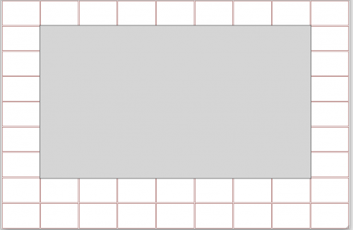
In order to determine this, I coded a 9 row and 9 column table with a div overalyed using z-index. I fiddled with the css’ size and margin until I got something that matched the constraints. The result is:#container {
margin-left: 11%;
margin-right:11%;
height:67%;
width:78%;
margin-top:11%;
}The page looks like this:
- Published to my blog 11 February 2012
- Archived here 2015